BYO
Challenging recycling. Championing reuse.
BYO leads with a provocation: recycling isn’t the solution we’ve been sold. Its app-based community challenges the comfort of tossing plastic into the right bin and calls for a different habit: reuse.
The Challenge
BYO asks people to question something they’ve been taught is good. The website needed to make that interruption count, turning a provocative message into a reason to act.
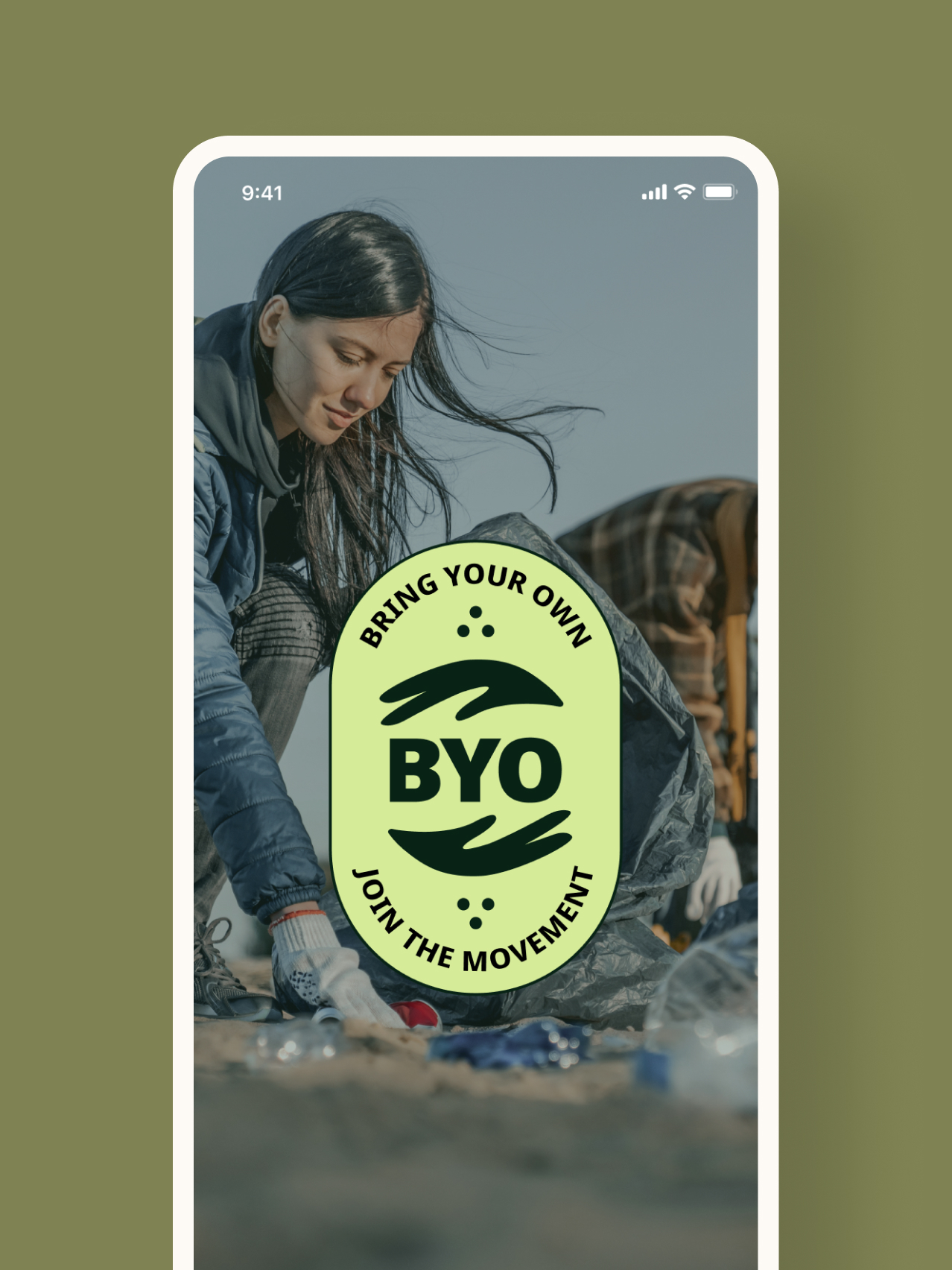
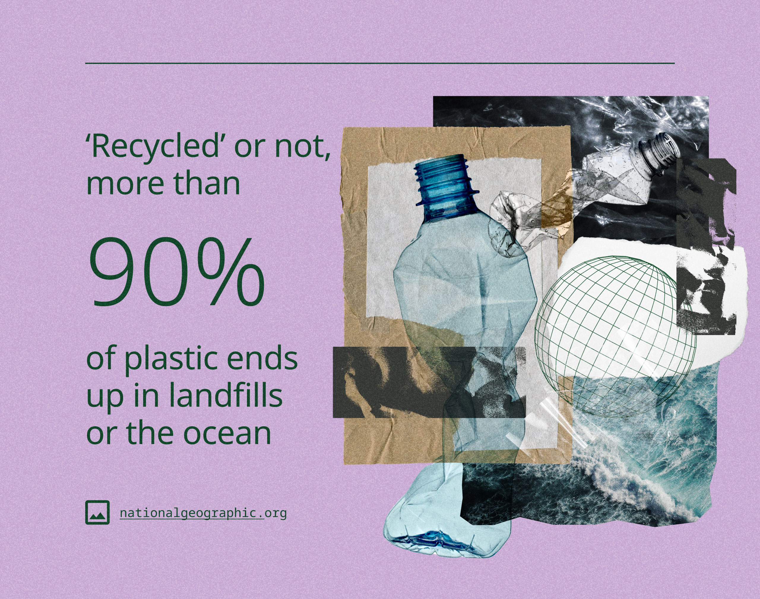
Bold typography, layered collages, plastic textures, and unexpected colors give the brand its rebellious character. The development challenge was to preserve that intensity in a working website, with reusable patterns that support consistency without making every section feel the same.
The Approach
The design system connects typography, color, spacing, and recurring components while leaving room for oversized statements and disruptive compositions. That foundation carries the expressive visual direction through the website.
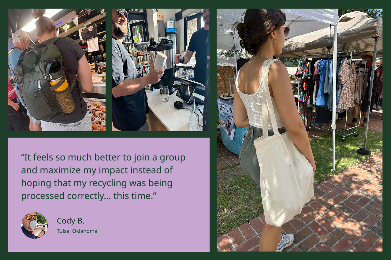
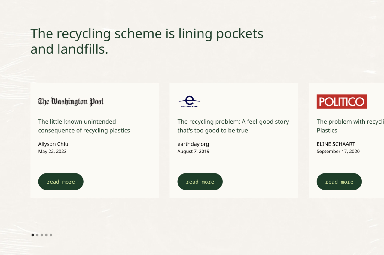
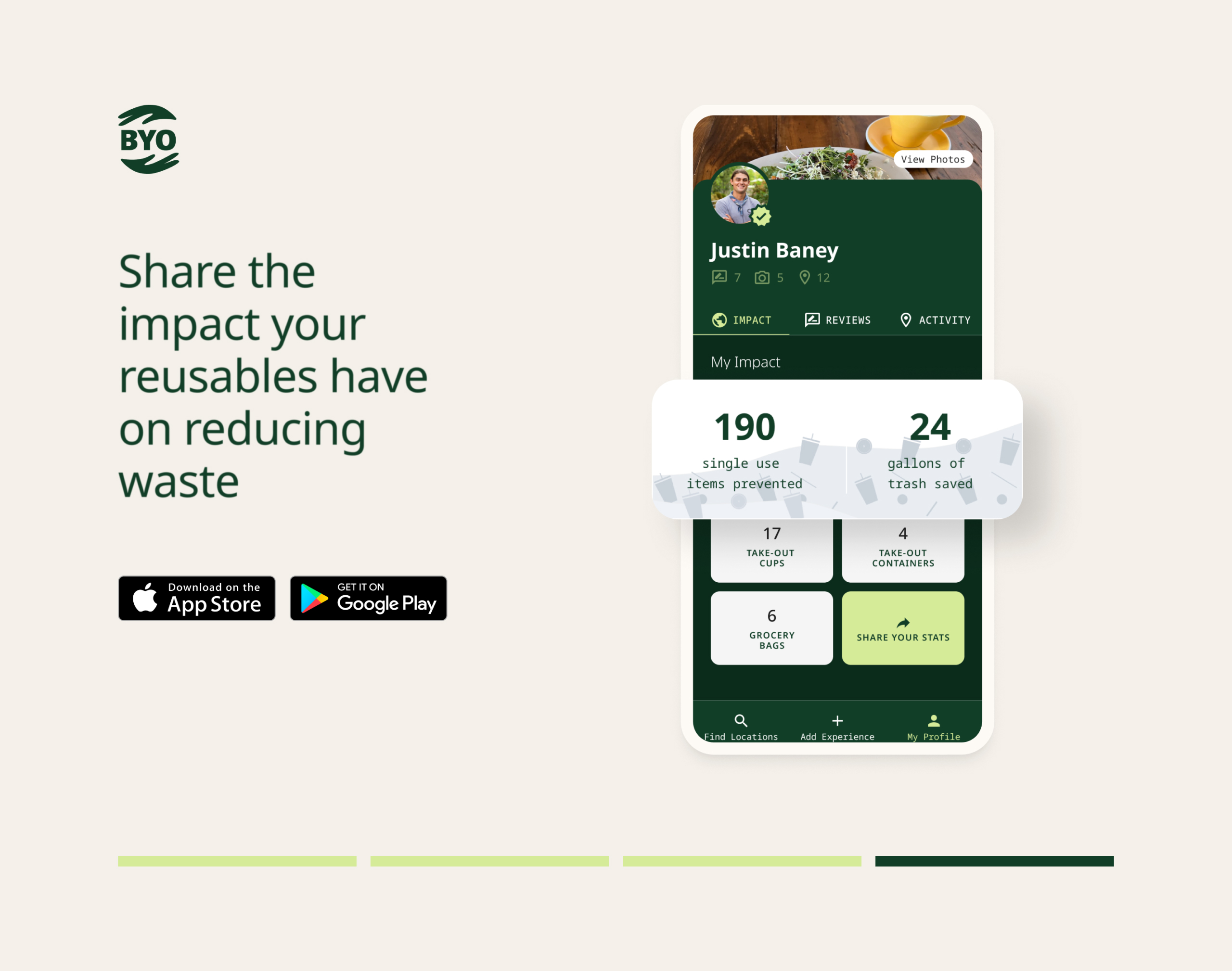
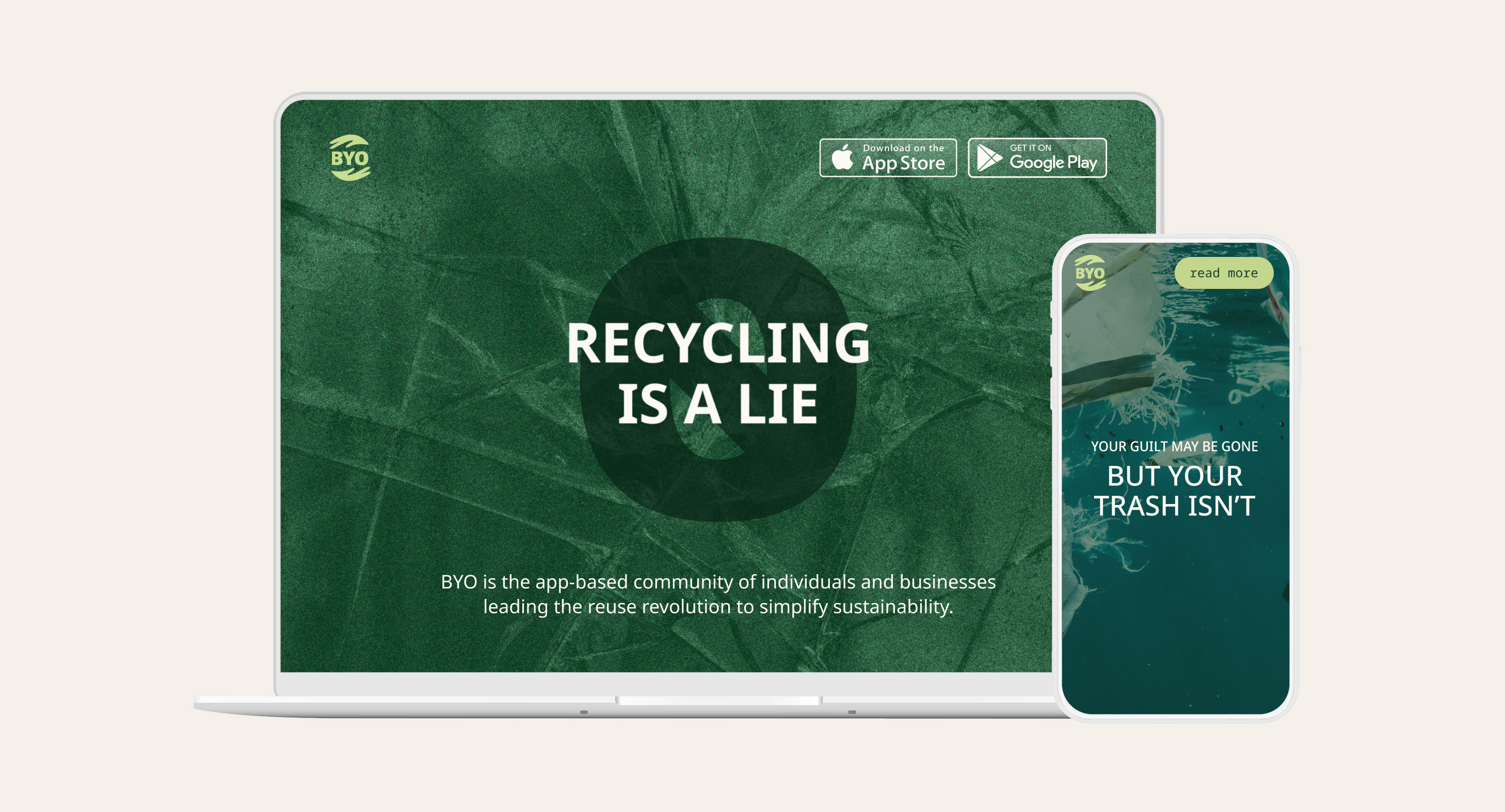
The experience moves from confrontation to participation. The opening challenges assumptions about recycling. Editorial resources invite visitors to examine those assumptions, while everyday examples make reuse feel achievable. App previews and download prompts provide a clear next step.
Together, the website and design system give BYO’s outspoken message a cohesive digital form, carrying visitors from “recycling is a lie” to “bring your own.”
Services
Source Portfolio
The Outcome
A bold website backed by a cohesive, scalable design system gives BYO’s anti-recycling message room to make noise. The experience challenges a familiar habit, makes the case for reuse, and turns the app into a clear next step. Question the bin. Bring your own.